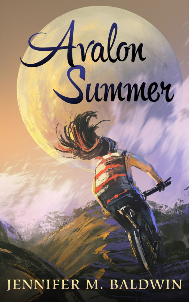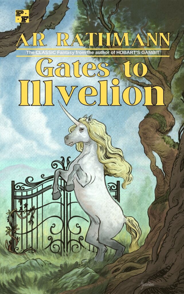

I love the vintage book cover art from the 1960s and 1970s. My husband and I have an entire box of the Penguin Books classic covers as postcards (and we’ve even framed some and hung them in the house). But I most especially love the science fiction and fantasy cover art from that time. Whenever I stumble onto an older edition of something, I get more excited for the cover art than for the book itself.
So I was delighted to read Charles de Lint’s book reviews in the latest edition of The Magazine of Fantasy and Science Fiction. In his review of William Morris’s The Well at the World’s End, he mentions the Ballantine Adult Fantasy Series, edited by Lin Carter. I’ll be honest and admit I don’t know much about the publishers of fantasy and science fiction. I know a handful of names that are involved: Tor, DAW, Del Rey, Ace. I even own a couple of Ballantine fantasy books (The Tolkien Reader and The Last Unicorn), but I never paid much attention to the publisher (until now).
Searching for more about the Ballantine Adult Fantasy Series, I found reviews of the books and the history of the series, but most especially, I found the cover art. I spent my morning just gazing at the artwork. I love interesting cover art. Not just for books, but also music albums, comic books, magazines, anything with a cover. I should probably do another post just about how much influence the Beatles’ cover art had on my childhood. But suffice to say, I don’t need the latest self-publishing guide to tell me how important cover artwork is.
I have purchased books solely because of the cover art, and I’ve skipped over books solely because of the cover art (Case in point: I refuse to buy any other versions of the Chronicles of Narnia except for the ones with the original Pauline Baynes art, or the 1970 Macmillan/Collier versions, i.e.: the ones I stole from my brother to read when I was eight) (Another case in point: When I look through my daily Book Bub ads, I am put off by the cover art on almost every title; a book has to have an extremely strong description to get me to overlook the lame, garish, and often cookie-cutter covers).
The Ballantine Adult Fantasy Series is my cover art crack. Without sounding too “get off my lawn!” about it, I wish that fantasy fiction still featured such surreal and whimsical art. Just looking at these covers has gotten my imagination going and given me ideas for my own fiction.


I can see where this style of art is perhaps too quirky and too dated to appeal to contemporary readers, but I find it fascinating. At some point, I’m going to have to start looking for a cover artist for The Thirteen Treasures of Britain, and I’m not quite sure what style of cover I have in mind. I wish I could get art that harkens back to the BAF covers, but that’s probably not a very smart business decision.
In the meantime, I can still gaze longingly at these beauties.